Upgrading your restaurant’s tech stack overnight.
<div class="project-video-wrapper" style="padding-top:66.6">
<video src="https://player.vimeo.com/progressive_redirect/playback/810793702/rendition/1080p/file.mp4?loc=external&signature=d2cdeef756c71f94ebf153f40f5d4feca1445fa9c4b53a7379453463c5d71b96" autoplay loop muted playsinline type="video/mp4" class="project-video"></video>
</div>


Overview
Open Tender
Open Tender unites point of sale, digital ordering, and loyalty for restaurants under one comprehensive, open source platform.
Collaborators
Industry
Time Frame
The Challenge
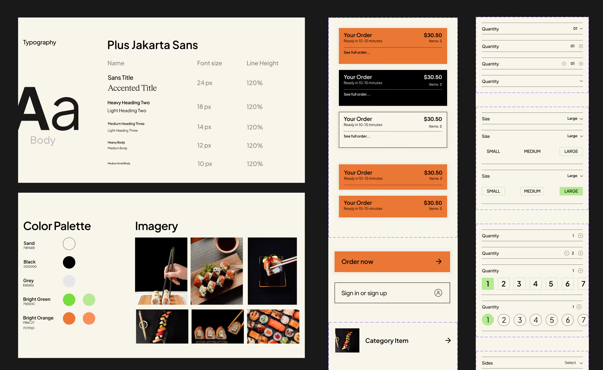
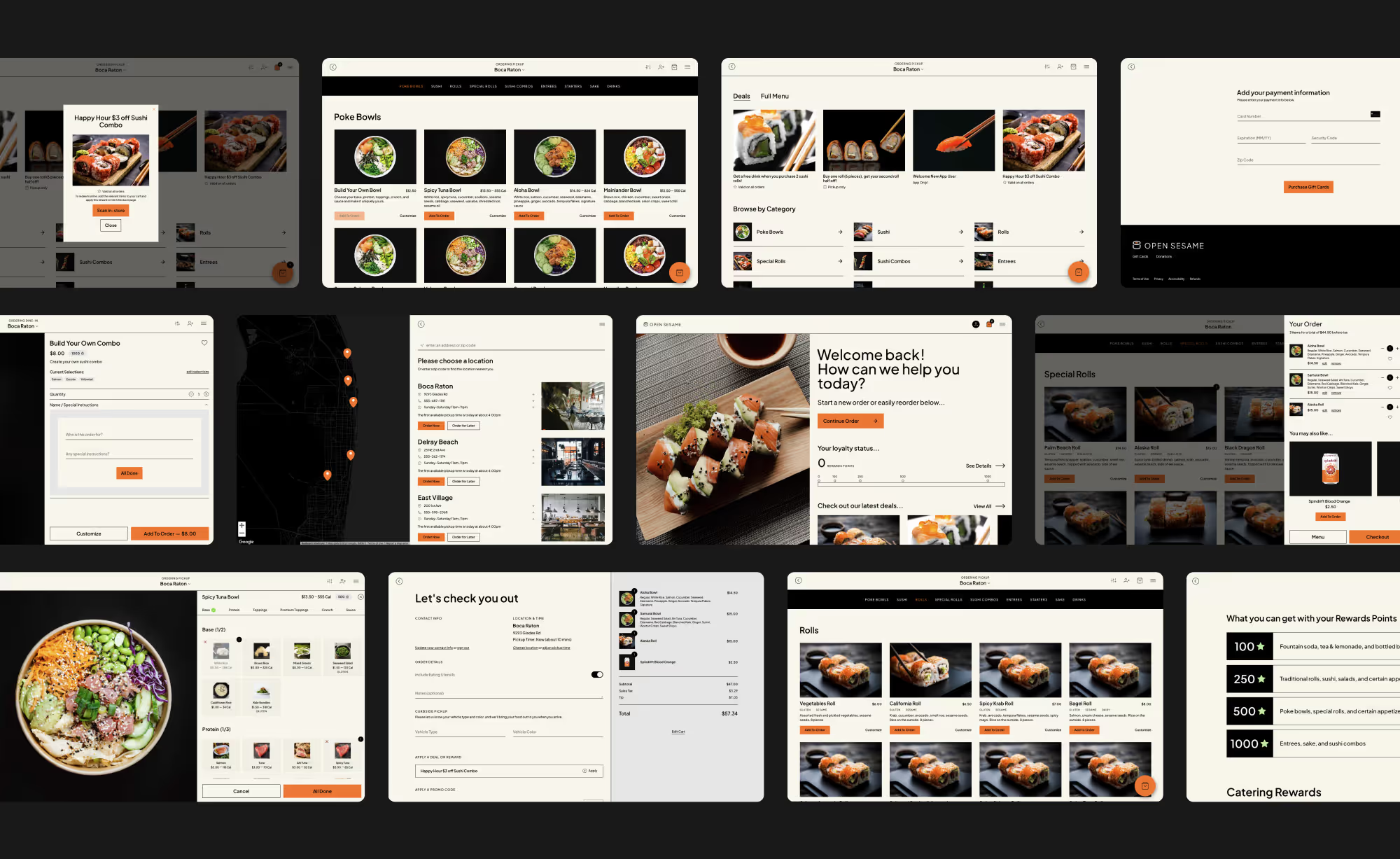
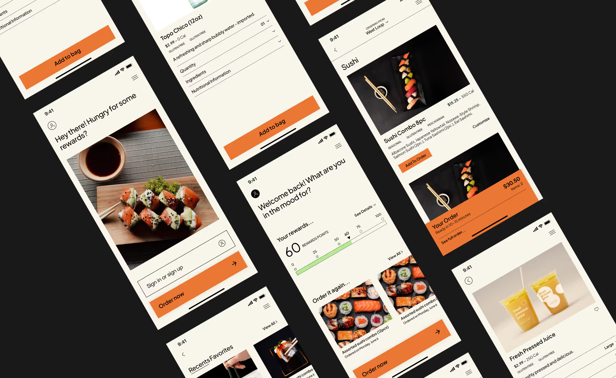
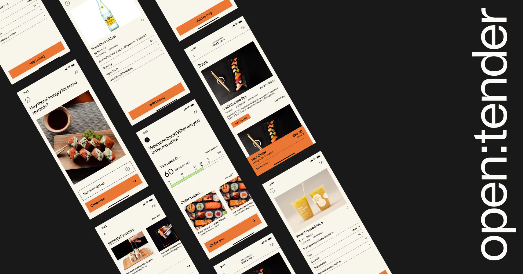
Open Tender is a restaurant-focused technology company that offers a comprehensive and open-source platform for point of sale, digital ordering, and loyalty services. They specialize in providing solutions for mobile apps, web ordering, kiosk systems, and other related services. In 2022, we met the Open Tender team for the first time and were tasked with designing a UI/UX for a fictional restaurant that would be used to demo their new mobile and web app. We named the restaurant "Open Sesame," a sushi restaurant, and created a robust design system and designed numerous screens across desktop and mobile. In our second project, we were challenged with a complete rebrand of Open Tender and a website redesign that would highlight their new identity.
Our Approach
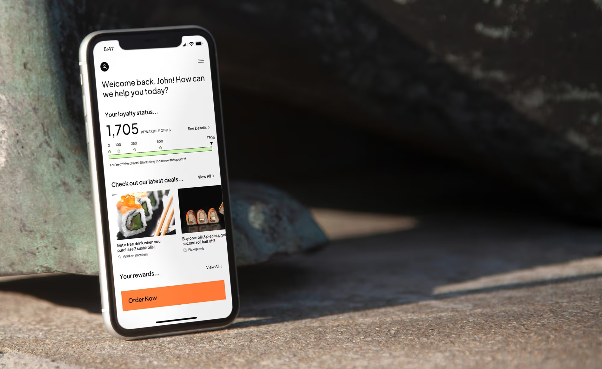
Our approach to the first project was to create a comprehensive UI/UX design system for Open Sesame that would showcase the capabilities of Open Tender's new web and mobile app. We designed a vast amount of screens for both desktop and mobile devices, ensuring that the user interface was intuitive, user-friendly, and visually appealing. Beyond that, we provided quality assurance (QA) assistance during the final stages of application development, just prior to launch.
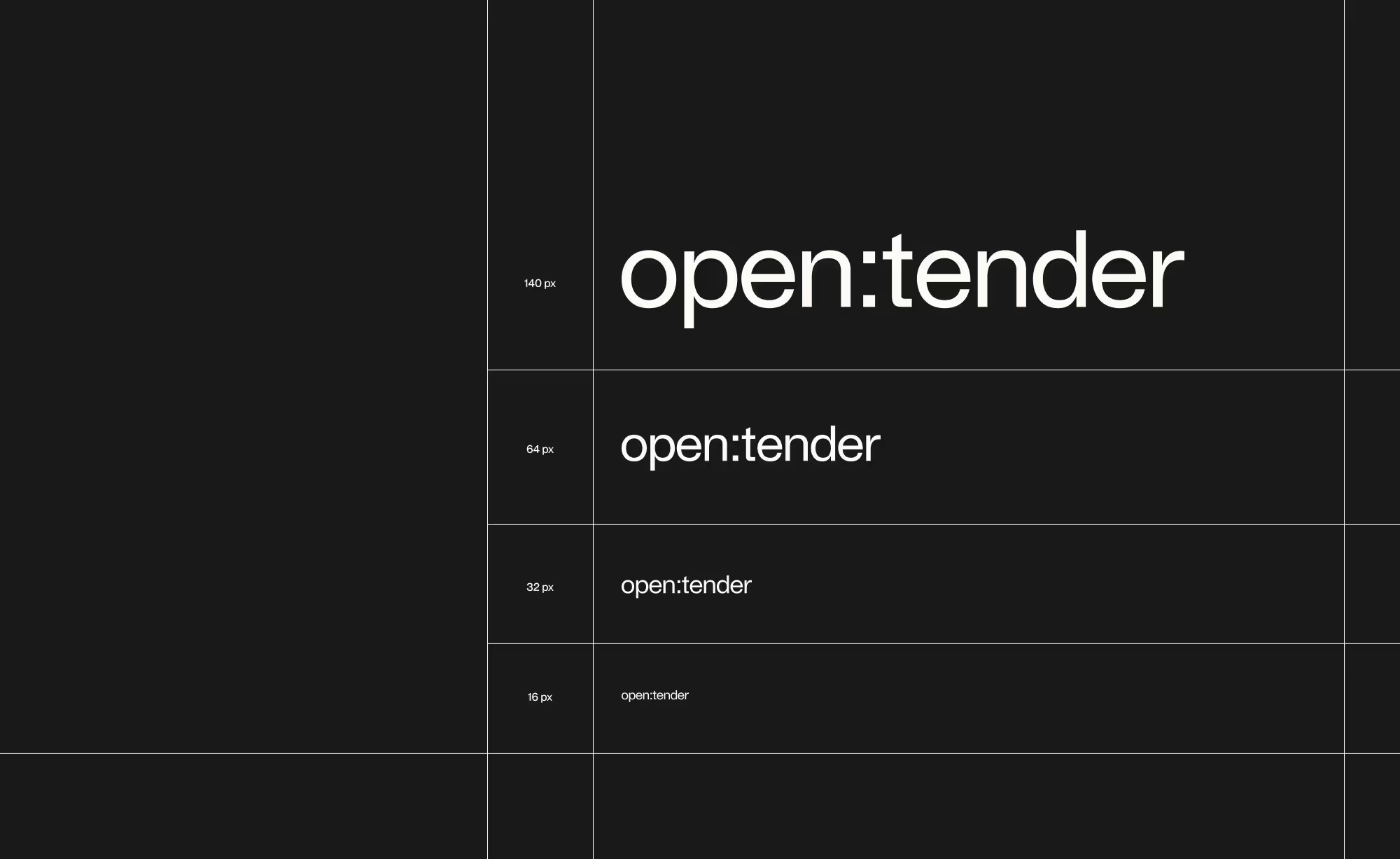
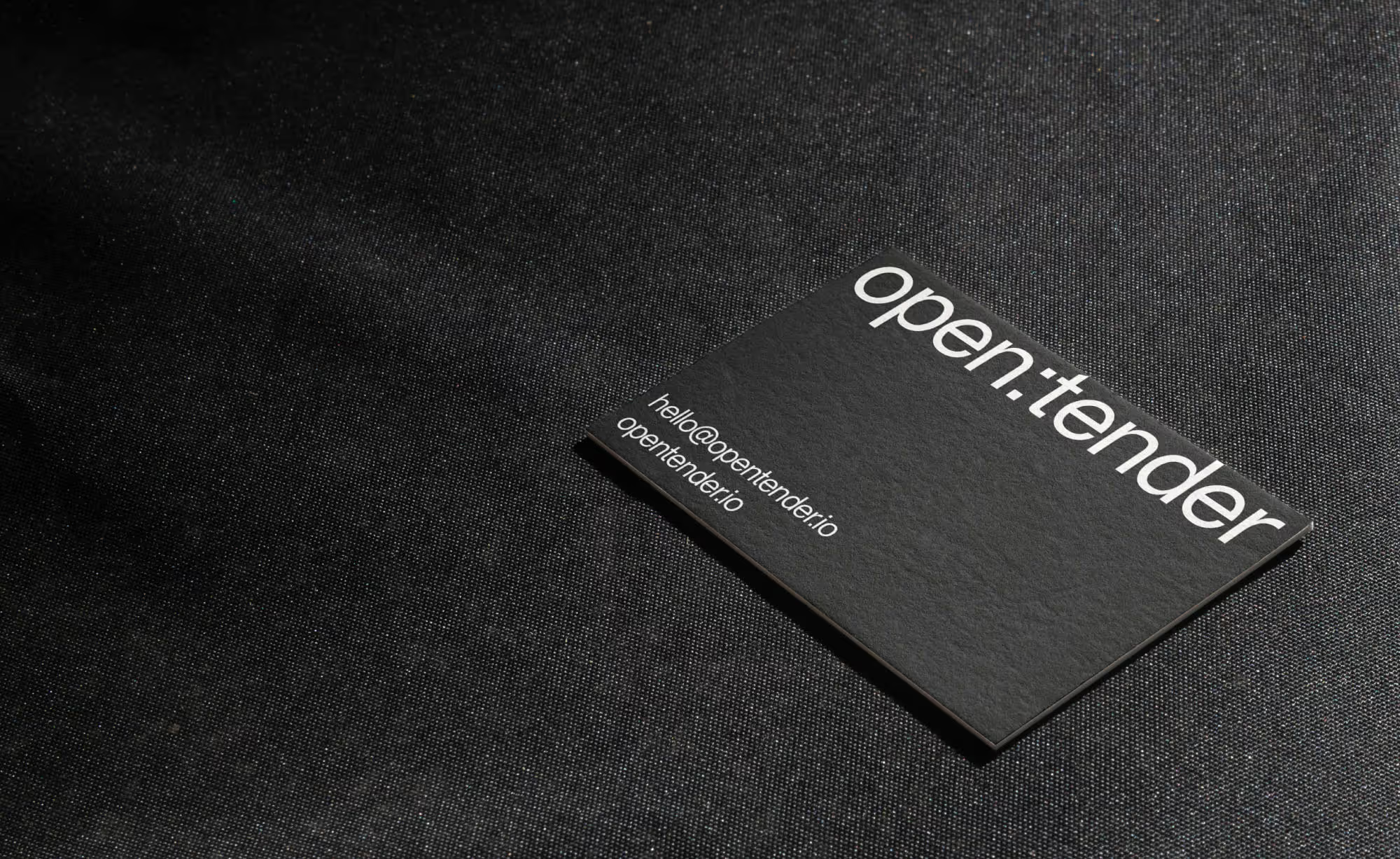
For the second project, we focused on rebranding Open Tender and rethinking and reimagining their website. Our approach was to create a more bold, sharp, and out-of-the-box brand identity that would align with Open Tender's innovative platform. We designed a new logo, selected new typography, and chose a color scheme that would differentiate Open Tender from their competitors. Our team also created a website that was an experience, with captivating animations and a storytelling approach to showcase the power of the mobile and web ordering applications.
The Final Point
Our collaboration with Open Tender was a great success. We were able to design a comprehensive UI/UX system for Open Sesame that demonstrated the capabilities of their new web and mobile app. The rebrand and website redesign showcased Open Tender's innovative platform and created a strong brand identity that differentiated them from their competitors. We are excited to work with Open Tender on their next project, which is focused on reimagining the Open Tender kiosk.
<div class="project-video-wrapper" style="padding-top:63.8">
<video src="https://player.vimeo.com/progressive_redirect/playback/811822833/rendition/1080p/file.mp4?loc=external&signature=bebca974bb50f91a07fb0478238b0f71b549385daaf02c588ffb9ea2f0fcb861" autoplay loop muted playsinline type="video/mp4" class="project-video"></video>
</div>


